Band Rebrand
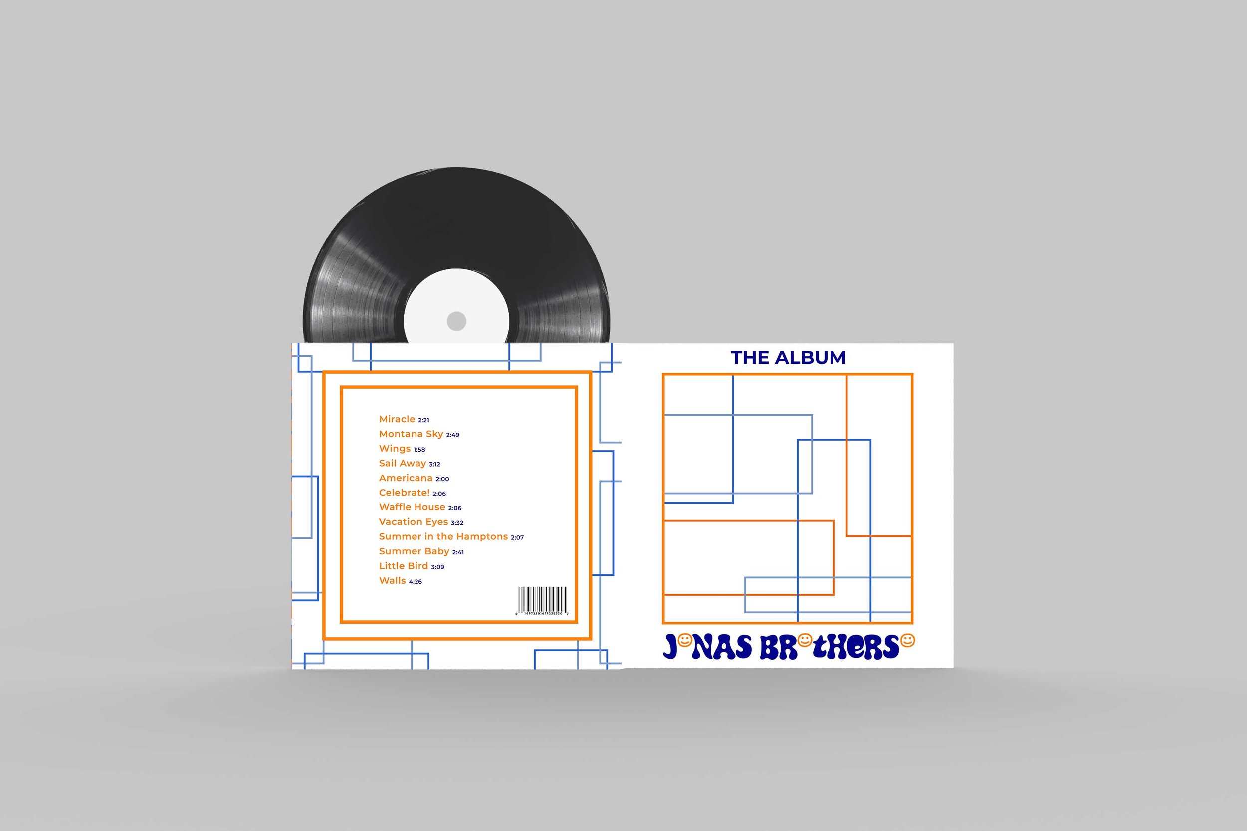
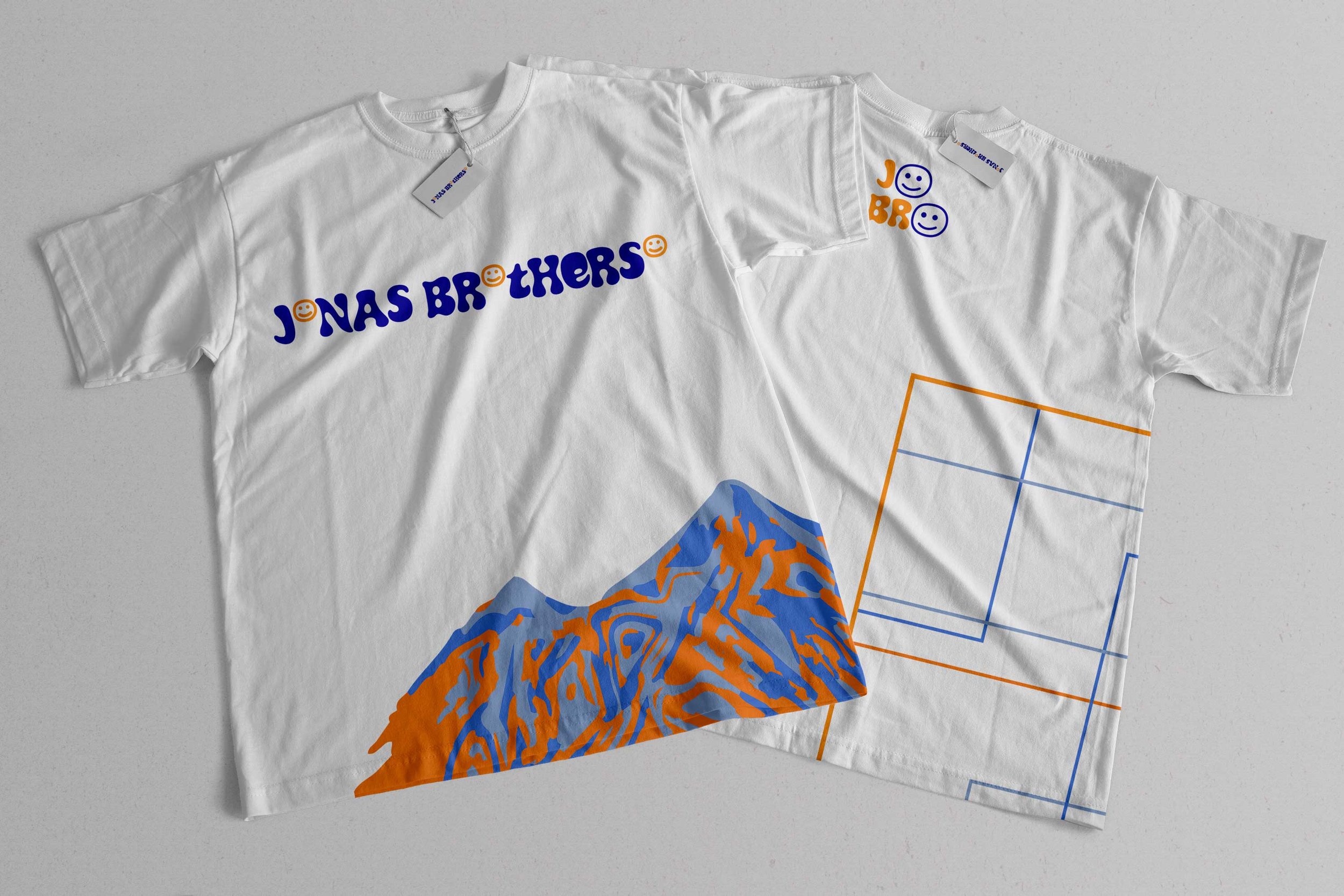
In our group project, we embarked on the task of rebranding the Jonas Brothers, crafting this distinctive logo in the process. Deliberating on typography, our aim was to capture a sense of fun, funkiness, and visual allure, leading us to select Synthemesc—a choice that perfectly encapsulated our vision.
Considering the musical trio of brothers, we incorporated three smiley faces, one for each member, into the design. Opting for orange and blue as our primary colors, we not only embraced their complementary nature but also their symbolic significance. Orange symbolizes happiness and youthful energy, while blue conveys serenity and stability.
Following the creation of the logo, the project transitioned to an individual endeavor, allowing each of us to further develop this rebranding concept independently. Opting for a more abstract direction, I crafted two distinct images: one featuring lines and the other portraying a mountain. Both align harmoniously with the band's identity, infusing a sense of whimsy and playfulness.


